Ralph M. Alley was an architect in Anchorage from the 1960s until 1986, when he relocated to California. He worked for larger firms at first, then in his own practice and later with business partners. In 1968 when he launched his own firm, Big Oil was ramping up its Alaska investment and a wild time ensued for four decades until the current hangover phase.
My dad had mentioned Alley before, and they were about the same age and were in Architecture school together at the University of Idaho. Ralph was gifted and stood out amongst his contemporaries, but with a good temperament and enough business sense to be able to succeed. Somebody who worked for him once told me, "He was a good architect. Some of his designs were a little weird" -- going on to imply that he was a decent role model and with a great grasp of the essentials [how to wrangle a contractor; how to get projects built the way they were envisioned and so forth].
Ralph was a design guru of Anchorage, in the way that Mark Ivy has been -- and Mike Mense, Catherine Call, Bruce Williams and many others, each in their own fashion. The clients who were tuned into what Ralph was doing were drawn to him implicitly, and he commanded respect by being thorough and attentive. I imagine when he told them he was planning a tapered, oval 14 foot high, skylight-topped light well at the peak of the living room ceiling, his judgment was not questioned.
Any great artist notices details at a level far beyond what ordinary humans take in. In Alley's case that translated to an intricate knowledge and understanding of quality of daylight on a daily, seasonal and annual basis; so unique to polar regions. A light quality that is stunning and fleeting. And this study became foundational to his design response to a site.
What I really appreciate about his work is its variety. He didn't have a "firm signature" or a certain approach that he mined. Like the musicians I most admire, he didn't stay put; rather, pursued many styles and conceptual frameworks and a truly individual approach to each project.
Some of the larger projects he completed survive relatively intact -- the Captain Cook Hotel, Evergreen Memorial Chapel downtown, and Fairview Recreation Center among them.
In 1999, Alley returned to Anchorage and conducted a tour of some of his projects. The tour concentrated on residential work. In some cases we got to look at the inside and outside of the house.
I was on the tour in 1999 and took a few photos.
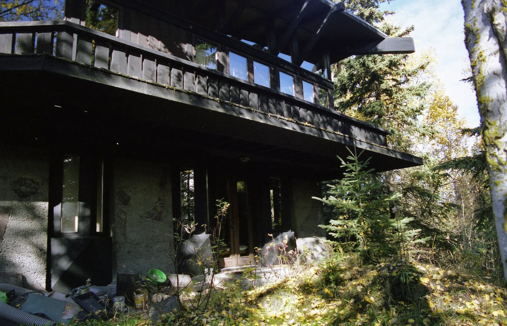
A house on Mallard Lane. There are two houses on this street and Alley designed them both. The street is at the north edge of the main campus of the University of Alaska Anchorage. Both houses are still there but feels like they are threatened by UAA's building boom. The concrete walls on the lower level have embedded stones like the walls at Taliesin West. I liked that the house is still a rich dark brown as it was originally.
Another side of the same house. Notice here that the canopy roof at the beltline is roofed with lapped cedar planks. Ralph may not have invented this detail, but I hadn't seen it before.
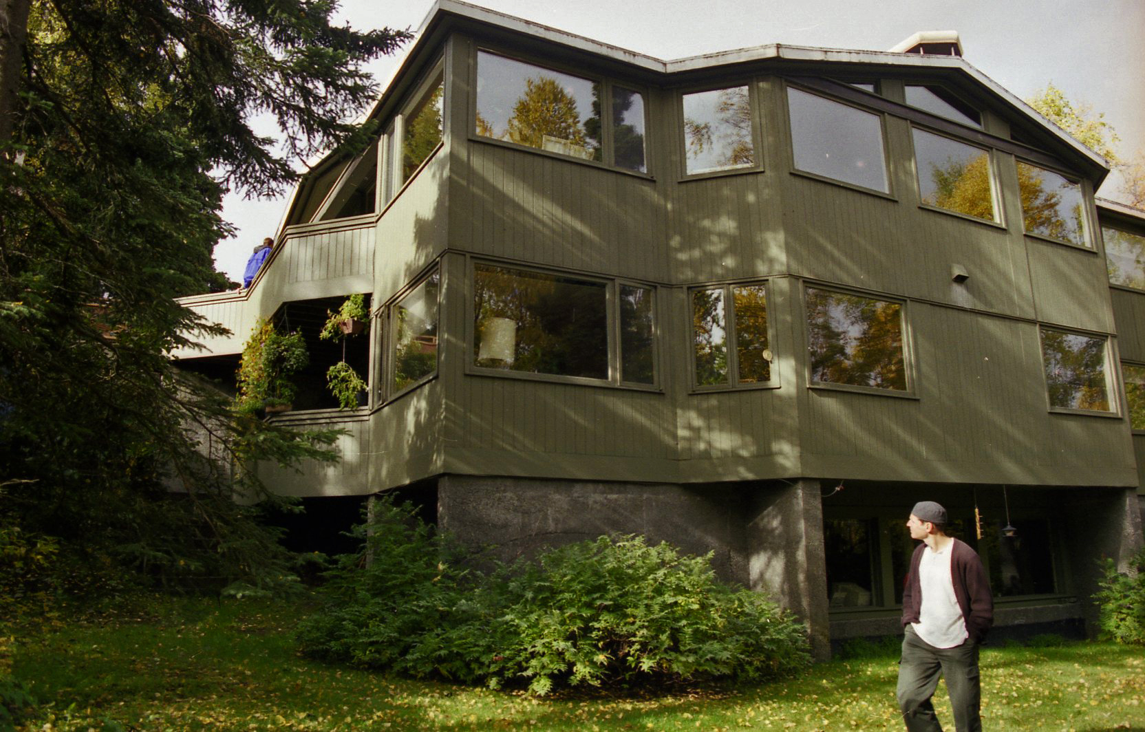
Back yard [south] side of the other house on Mallard. Can't recall for sure but it may be that the lower portion on the left was an existing house. Alley's remodels typically involved a thorough reworking of any existing re-used spaces.
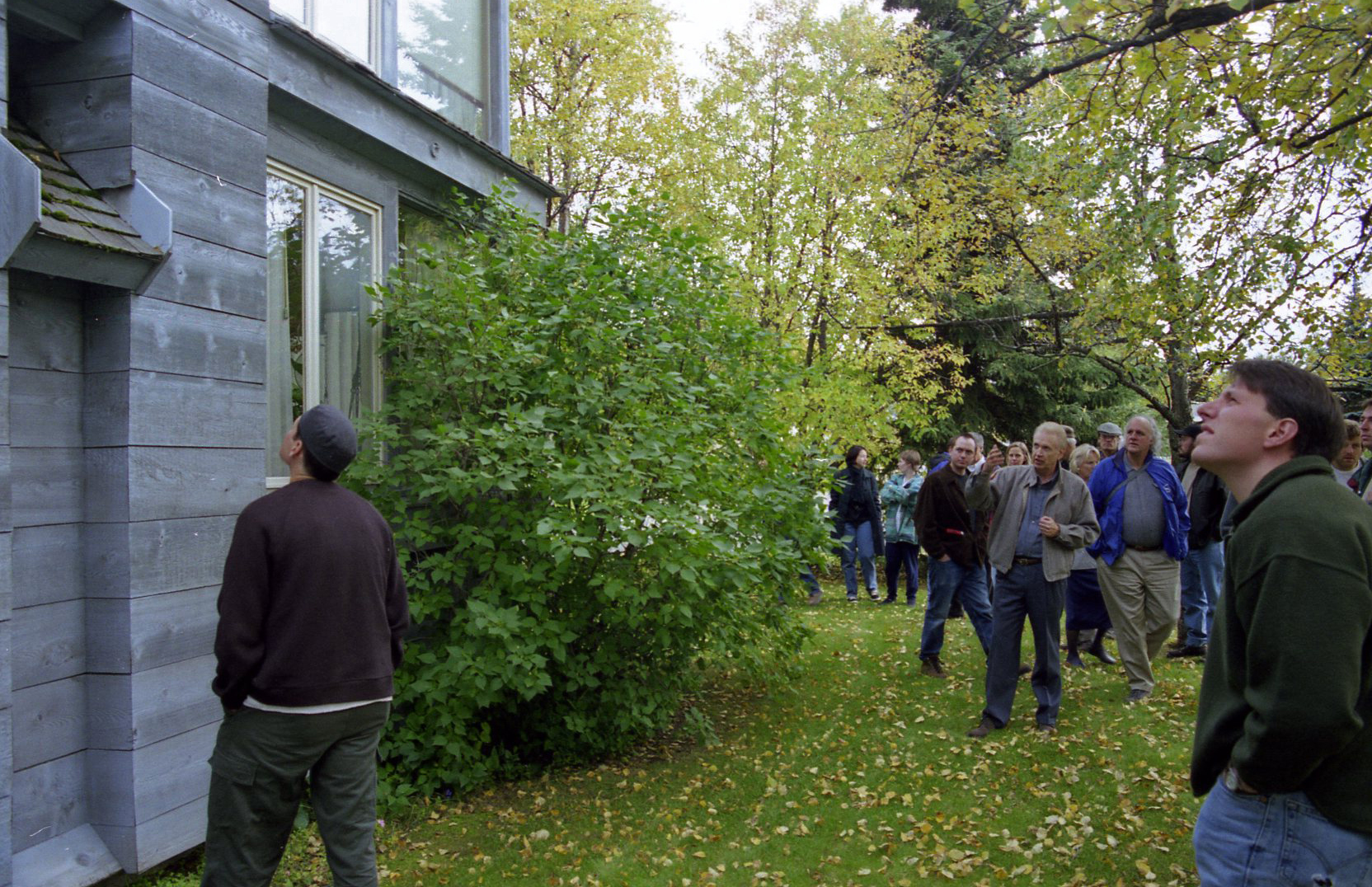
And here is the man himself, pointing out some of the details of the roof shape and drainage, and fenestration of a house on Arlington Dr. in Spenard-Turnagain. Elements are shifted compared with expectations and ostensible placement -- for example, the first floor windows all appear to be typical height and head height, yet the large portion of the first floor is a high ceiling space, the floor of which is below grade and the window sill height is 4 feet. Alley related a tale of how this house got called the ugliest house in Anchorage. [It is far from that!]
The roof is an inverted pitch [as can be noticed in the upper right], with drainage through spillways slotted through. We didn't get to go inside this one -- would have loved to see how the second floor spaces were used. The balance of the house rambles a bit, taking advantage of its site with its south exposure on the long side of a corner lot.
Street side of house on Hillcrest Dr. This photo from 2016, since I didn't have one from this side in 1999. The main entry door [not the original door] in the center between two stealth garage bays. Inside the door are slatted walls dividing off the garage bays and making a fairly wide passage to the main space of the upper level.
Back to 1999 and the other side of the same house. This side faces east. The partially covered decks on two levels are positioned to get good afternoon sun. In the foreground is Tony Zedda of Kobiyashi Zedda Architects, who was visiting Anchorage at the time and went on the tour. He was the only one of the group who walked all around each house and observed it from all angles. I noticed him at each stop when scouting photo locations.
Upper level interior at Hillcrest. The woman at center frame with red jacket was along with the tour and this house was her childhood home in the '70s. Her father must have hired Alley to design it. She hadn't been inside for awhile and seems strangely fascinated. To her left in the photo, Alley speaks to another tour participant. On the right of the frame [white hair, glasses and green shirt] is Ed Crittenden [1916-2015], Anchorage architect of major stature. Ed and Ralph carried on an amusing banter in the van, driving between projects. It must have been much the same as their '60s and '70s interactions. Ed's projects were much larger but everybody wanted to hear Ralph talk. Sort of, the difference between immense respect and true love.
Another 2016 photo, this one of an Alley house on Stanford Dr. Almost all its original features and color scheme remain. Love the thin lines projecting down from the gable on the white panels, adding a graceful touch to an assemblage that's otherwise a bit heavy-handed. This man really knew what to do with a few good diagonal walls, and how to articulate a façade. The entry area is a recent remodel, but a sensitive one.
Further to the right on the same street side of the house, 17 years ago with the tour group. This roof projection begins at the cantilevered beam as a soffit, and somewhere between there and the corner of the house becomes a fascia. And more of the thin line accents on a white field.
This house, more than any of the others we saw that day was where Alley's full range of creativity and novel concepts were unleashed. Someplace in the middle is a standard Turnagain tract house that left its foundation and slid down the street during the 1964 earthquake. The house was moved to this lot [off Raspberry Rd., west of Sand Lake Rd.] the following year, and surrounded by multi-level additions. This house was designed for Lowell Thomas Jr., an adventurer/entertainment producer and former Lt. Governor of Alaska. Thomas and his wife sold the house and moved to Hillside after the construction of a perpendicular runway at the airport made the neighborhood a lot less peaceful than previous, but the house survives fairy intact. There is a large living room with dark stained shelving that used to house Thomas's fabulous book and artwork collection.


![Back yard [south] side of the other house on Mallard. Can't recall for sure but it may be that the lower portion on the left was an existing house. Alley's remodels typically involved a thorough reworking of any existing re-used spaces.](https://images.squarespace-cdn.com/content/v1/5771e6b1f5e2314b4833ec6d/1468309411968-Q6YGTZCJZ25DG5AA85YZ/image-asset.jpeg)

![The roof is an inverted pitch [as can be noticed in the upper right], with drainage through spillways slotted through. We didn't get to go inside this one -- would have loved to see how the second floor spaces were used. The balance of t…](https://images.squarespace-cdn.com/content/v1/5771e6b1f5e2314b4833ec6d/1468309887474-6IZI5GI6NOV8BY2SWH9Y/image-asset.jpeg)
![Street side of house on Hillcrest Dr. This photo from 2016, since I didn't have one from this side in 1999. The main entry door [not the original door] in the center between two stealth garage bays. Inside the door are slatted wall…](https://images.squarespace-cdn.com/content/v1/5771e6b1f5e2314b4833ec6d/1468310163745-GBLQ81KI07P0QVGH91E7/image-asset.jpeg)


