
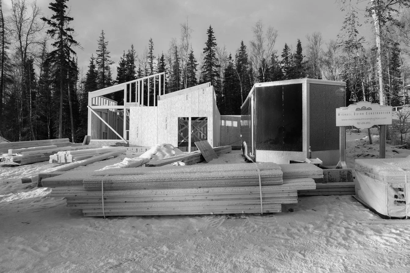
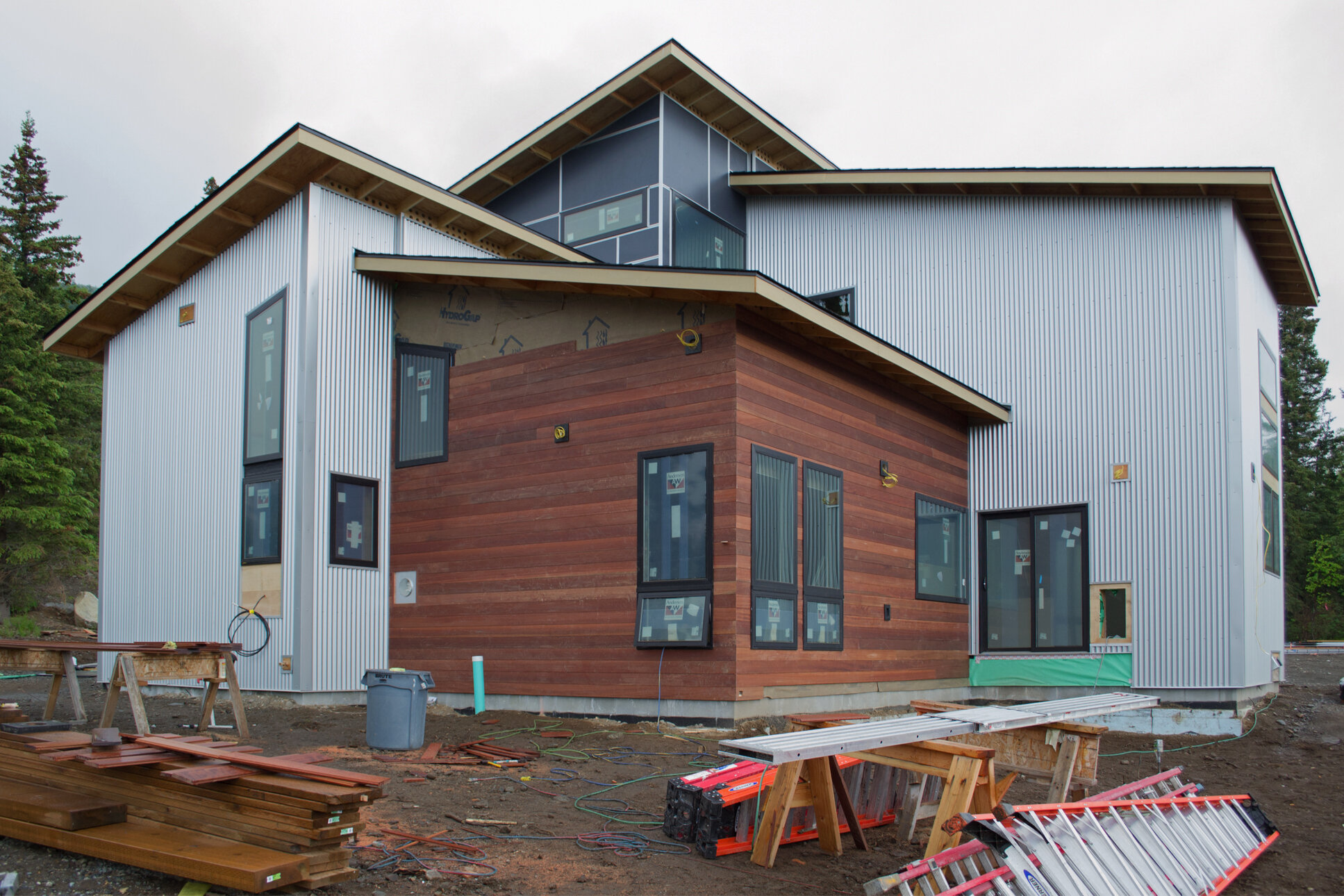
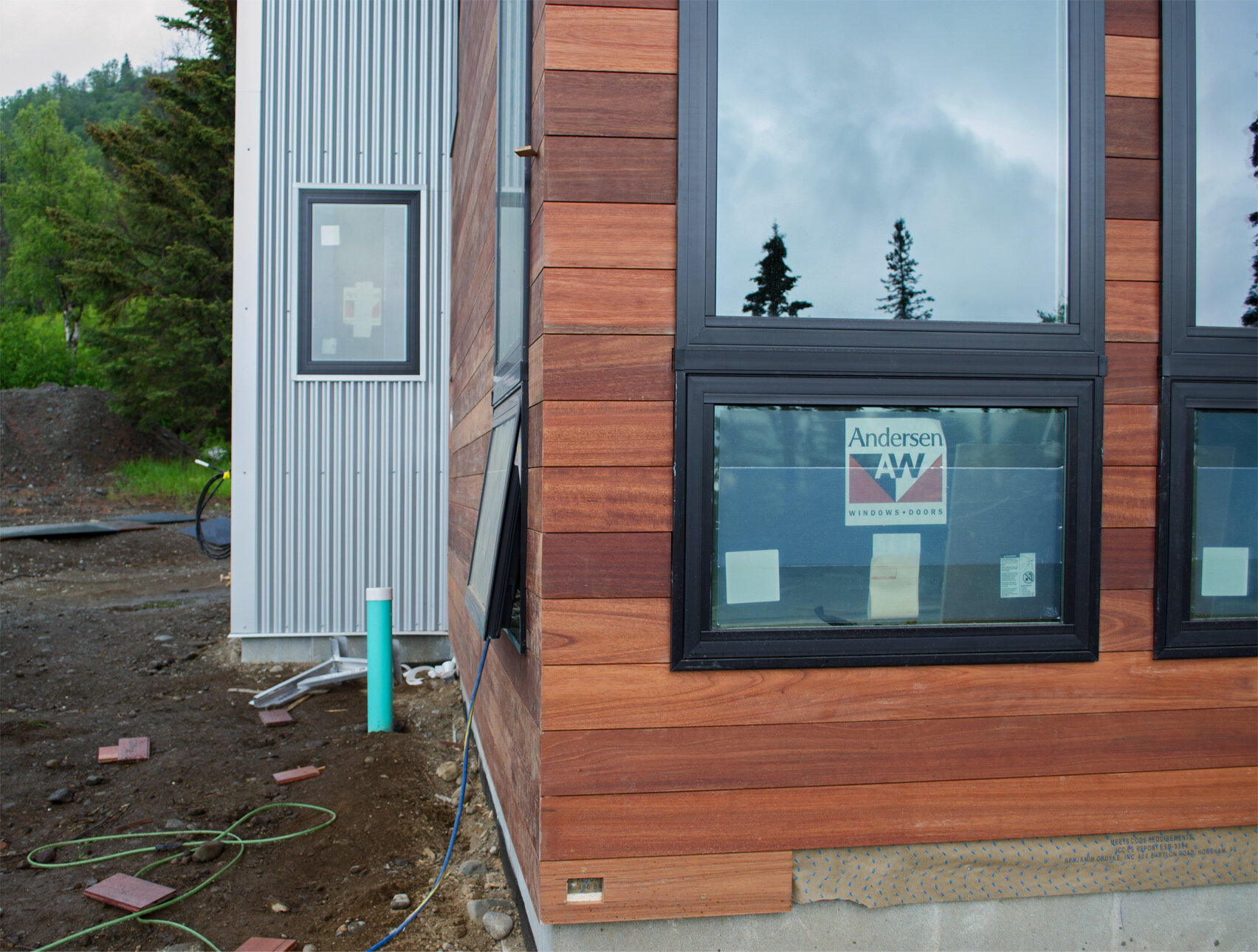
This house was designed in late 2023 and construction began in Fall 2024. Will have more to say about it later in Featured Projects. Photos taken January 5, 2025 when the first floor perimeter was almost complete.
Approx. 2,400 square feet living area and 3,200 total square feet. 3-BR, 2.5-BA. High, sloped ceiling in the living area, well-sited with south exposure and territorial views. Michael Quinn Construction.


Under Construction: Stuck Again II
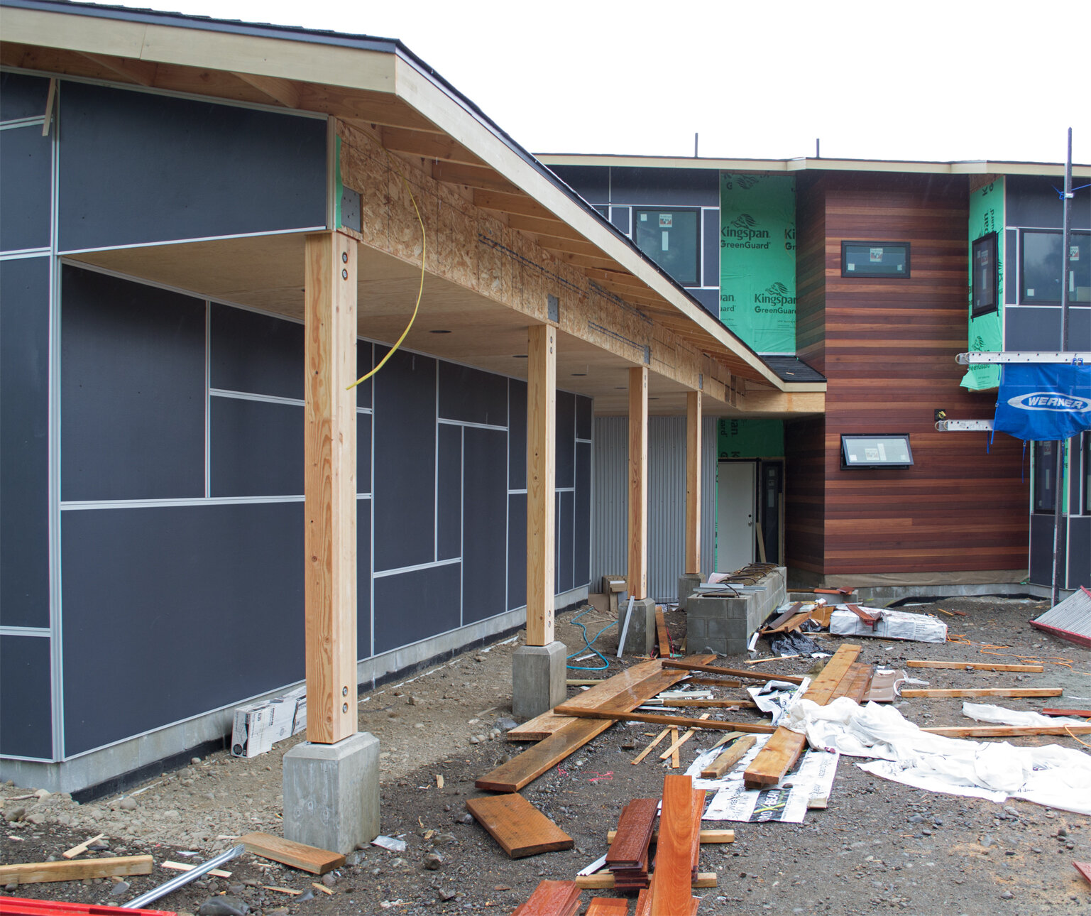
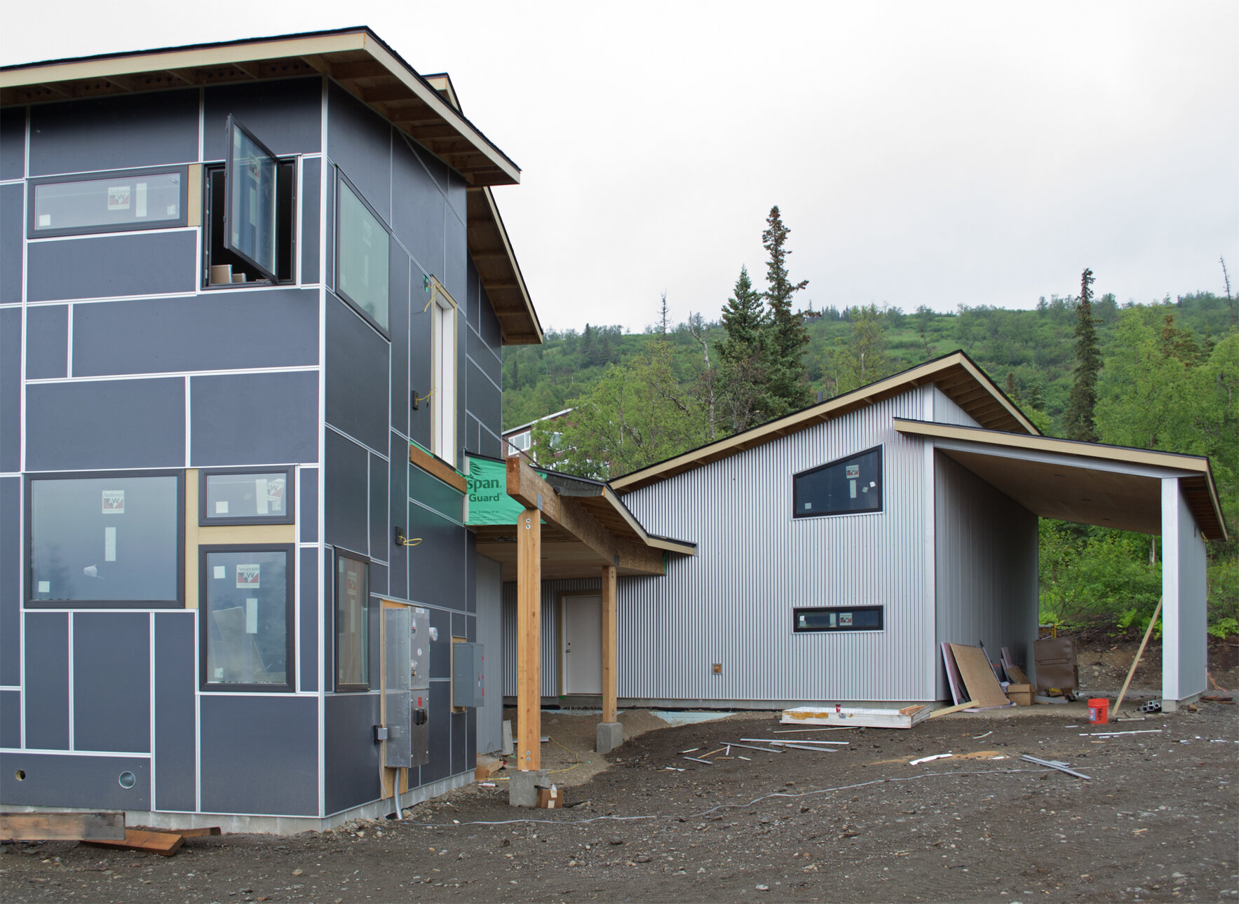
This new construction house is the second one designed by Clark Yerrington in Stuckagain Heights and the first to be built. Construction began in October 2019 and is now around two-thirds complete, with drywall underway inside and siding outside. The general contractor is WaterMark Alaska.
The neighborhood is magnificent, relatively quiet and unspoiled; with lots of hiking trailheads on its access road that range from densely wooded trails to sub-alpine meadows at higher elevations. It is not connected by road to the more populated part of the Anchorage Hillside to the south. The two-acre and larger homesites are rural-feeling and not encumbered by overhead power lines, or much else in the way of infrastructure. The overall effect is extremely charming.
The house was not supposed to be showy or ostentatious upon approach. It is quirky in presentation but not that much different than a standard two-story house. The garage is detached and connected to the house via a covered walkway and breezeway. The interior is an interesting combination of high, soaring space and low, intimate space convening two levels.
There is approximately 3,200 square feet of living area, plus 940 square feet in the garage. The garage also has a loft storage area and an attached tall carport for boat or RV parking. There are four bedrooms and three full bathrooms. There is a separate entrance to a Mud Room [also accessed from the breezeway] with an adjacent Gear Room and dog wash shower. There is a media room, separated from and adjacent to the main living area.
Covered walkway leading to the main entry door.

The garage has one 8x8 ft and one 10x8 ft door. All of the ceilings in the house and garage are sloped, at 3 in 12 pitch the same as the roofs. Credit to WaterMark for the design of the glu-lam columns with beautifully finished cast in place concrete bases.
![Looking south along the east wall of the main house toward the covered walkway and detached garage. The territorial view of the water and the flat part of Anchorage [looking west] is to the right. The view of the mountains to the east is also quit…](https://images.squarespace-cdn.com/content/v1/5771e6b1f5e2314b4833ec6d/1592685782259-N0ZZSE3QTT0H8718UHQ8/061920+N+ext+01.jpg)
Looking south along the east wall of the main house toward the covered walkway and detached garage. The territorial view of the water and the flat part of Anchorage [looking west] is to the right. The view of the mountains to the east is also quite special — jaggy, rocky peaks partially snow-covered even in summer [can’t be seen now on a cloudy day].

Looking north — main house, breezeway and entrance to Mud Room, detached garage and boat/RV carport.
Looking east-northeast. There will be a small balcony off the Master Bedroom at the end of the breezeway where the beam is sticking out.
![Where the walkway meets the rest of the breezeway, main entry door alcove to the left and east wall of the house [bedrooms and bathrooms], looking north.](https://images.squarespace-cdn.com/content/v1/5771e6b1f5e2314b4833ec6d/1592686245588-UBQXDOE9FCT8ESASJ7GD/061920+S+ext+entry+dtl.jpg)
Where the walkway meets the rest of the breezeway, main entry door alcove to the left and east wall of the house [bedrooms and bathrooms], looking north.
Looking SE — media room on the left, top of stair area topmost, living room with wood-look siding and kitchen on the right. There will be a deck, about 15x20 ft between the kitchen and living room, set three steps below [access from a small porch outside the sliding glass door from the kitchen island area] so as not to block the view from the house and so the deck will be close enough to the ground to not require railings. The deck takes in the best territorial view while being private from surrounding properties.
Lower part of living room windows go down to the floor. Media room beyond. Looking east.

Interior of main living area looking north. Kitchen island, door to deck. Dining table where the gypsum board panels are leaning against the window. Living room beyond. There will be a gas fireplace below the high window on the right. [The drywall hasn’t been fully cut out of the window openings yet; height of windows on the long wall match the one in the background.]

The stairs are temporary. The finished stair will be shop-fabricated metal with wood treads and will be mostly open.

Two doors to the porch and deck, one for the owners and their guests and one for the canine companions.

Looking east from the kitchen. Entrance to media room out of frame to the left of the stairs. Guest Bedroom and bath straight back. Above, a wide landing/gallery area outside the Master Bedroom and second bedroom. I did not venture upstairs this trip, so I would not disturb the workers who were furiously finishing the drywall installation.

Looking southeast at the stairs from the living room. Door to media room on the left. Upstairs, second bedroom on the left and master bedroom on the right and beyond the kitchen.

Outside media room entrance, looking southwest back toward kitchen.

Kitchen looking west. The kitchen is the grandest part of the main level. It also has an adjacent walk-in pantry, out of frame on the left.
Looking south into the entry hall. Guest suite access up two steps, out of frame on the left. Coat closet, then main entry on the left. On the right, pantry, then laundry that also contains a separated mechanical room; spare bedroom office on the right [southwest corner of house] and mud room/gear room straight ahead. Ceilings in this part are 10’-8” high.

The spare bedroom office will be a cheerful work space, with windows on the south and west sides. The territorial view is available from here but the windows are mostly oriented toward a forested part of the lot nearby.
FRamE Hall of Fame: John Margolies
The photographer/architectural historian [1940-2016] is a FHoF member because of his pluck and determination to get respect for American Roadside kitsch and Outsider designers.
Margolies channeled his anger — acquired on childhood trips during which his dad would never stop the car to let young John look more closely at roadside stands, zippy signs, and miscellaneous bric-a-brac — into a four-decade odyssey of zig-zagging the contiguous states in search of as much Route 66-style fandango as he could find. He put out 12 coffee table books of the findings. What a dream job!
In 1970, before hitting the road full time, Margolies used his platform as a feature writer for Progressive Architecture to write about [and around the same time, organize a gallery exposition of] the work of Morris Lapidus, a giant pink, purple polka-dotted gadfly of hospitality design who threatened to scatter his more serious contemporaries to the outskirts. Imagine the quaint backlash that must have ensued.

Madonna Inn, dining room. Photo by Carol M. Highsmith, from Library of Congress archives.
As a parting shot to the New York City modernists and architectural criticism, in 1973 Margolies wrote a piece in P/A about the Madonna Inn — the roadside hotel and Outsider designer experience to beat all. Owner/designer couple, Alex and Phyllis Madonna brought their A-game to the effort and the result [in the original 12-room inn opened in 1958, and expansion to 110 suites in multiple buildings, still in business today] is weird, woolly and wonderful. [If you like its kind of thing, you know.]

Steel’s Fudge, Atlantic City, NJ. Photo by John Margolies, 1985 from Library of Congress archives.
When Fred Trump, father of President Donald Trump demolished Steeplechase Park in Coney Island in Brooklyn, NY in 1960 it was because it was in the way of a real estate scam and attendant theft of public funds — along with displacement and destuction of an immigrant/minority community — both a sad by-product of the main game. When Donald Trump started on Atlantic City two decades later, the business deals were slightly more above board; the racism/class-ism slightly more veiled — and the destruction of lowbrow cultural infrastructure [piers, arcades, old hotels and all else that made the place charming] was just as awful. I was looking at photos of Trump’s Mar-a-Lago recently and noted how much parts of it resemble the Blenheim Hotel, fronting the AC boardwalk from 1902 to 1978, a grand cartoonish palace that should still be standing today instead of Trump’s bankrupt bland tower.
Of course, a lot of people didn’t get it. Many still do not, even though it’s been 40 years since Robert Venturi and Denise Scott Brown told us all that it’s safe to enter the Funhouse. Shortly after his death in 2016, the Library of Congress assimilated the bulk of Margolies’s photo archives and put them in the public domain — available to pore over [hopefully] and inspire developers and others to break from the corporate mindset and make America weird once more.

Hat n’ Boots gas station, Georgetown neighborhood, Seattle, WA. Photo by John Margolies, 1977 from Library of Congress archives.

Bob’s Java Jive, Tacoma, WA. Photo by John Margolies, 1979 from Library of Congress archives.
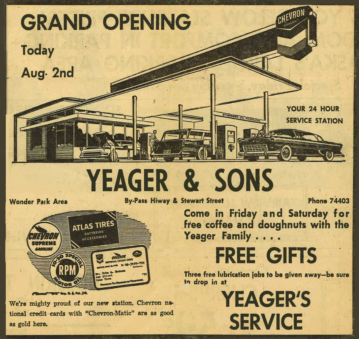
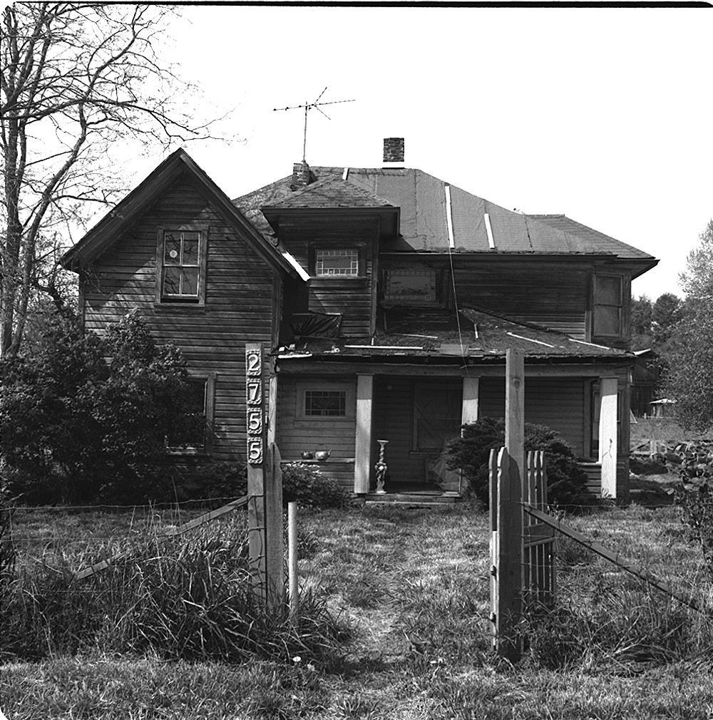
Projects We'd Like to See: Yeager's Service
It is amazing that this building still exists. I’d been curious about its past for a long time, and many of the answers popped up in a post in a Facebook group, You Know You Grew Up In Anchorage If… — a place where people (some of whom used to live in Anchorage and some of whom still do) recount people, places and events from the past, with varying degrees of accuracy. Mr. Randall Montbriand in the Facebook thread, a neighbor of the original owner/developer of the building provided information, perspective and memoribilia that are shown here.
Municipal records indicate the building was constructed in 1955. Anchorage was connected by railroad to points north by 1923, but it took a lot longer for a road connection to be made. It became possible to drive to Eagle River by the late 1940s, but the crossing of Eagle River was then a harrowing prospect in the winter — the road made a 90 degree turn at the top of a bluff and then plunged down a ravine to the river bank. Over the years the grade was reduced many times (the most recent time was five years ago) and the former two-lane became a divided highway in the 1960s.
Sometime before 1955, a bypass section of the highway was built just east of Mountain View at the NE periphery of Anchorage. The bypass allowed access to and development of the Wonder Park neighborhood. An early Wonder Park homeowner, Victor Yeager saw potential for a highway stop gas station and managed to get it built. When it opened it was a cut above the typical Anchorage gas station. There was only one other vintage gas station I recall that had any character and quality — one from the ‘20s at the NE corner of 4th Ave. and I St. where the pump was sheltered by a corner cutout of the building mass. That station was torn down in the ‘70s. Most of the stations until the ‘60s consisted of a pump island with no roof in the middle of a rutted dirt lot, and a dirty shack containing an attendant and cash register.
In 1964 the State of Alaska began a process to improve the highway (now renamed the Glenn) — straightening the route, bypassing Mountain View in the process and regrading transitions. A portion of the existing bypass where it passed Yeager’s gas station was retained, but the road bed was lowered 25 feet there and the roadway moved slightly to the north. The Yeagers attempted to broker a deal to provide an off-ramp, and were unsuccessful. A new frontage street, Taku Drive was created that was accessed from points south in the neighborhood. Business at the gas station suffered. I’d assume Yeager later regretted not cutting a buyout deal that would have given him resources to relocate. Perhaps there was some compensation? It isn’t clear. In any case, the business soldiered on — renamed Wonder Park Texaco in the ‘60s — until sometime in the ‘80s when gas sales ended and the building became an independent repair garage under new ownership. The garage closed in 2003 and the building has been unoccupied since then.
Many have taken notice of the building and imagined new uses. It is now really rundown but not past the point of no return. I’d imagine most would assume it’s a teardown; I see potential in every place though. Some perspective for those unfamiliar with Anchorage — most of its development occured after the 1960s. The first buildings taller than three stories and not wood framed appeared in the 1930s. There are 300,000 residents now. There are few remaining historic buildings, and only two with origins before 1915. Consequently, we have an acute shortage of 19th century brick garment factories — or any other old buildings available for renovation and adaptive re-use. So when this building with its 14 foot high garage bays sits there it will generate interest, despite a lack of distinction in a more general sense.
The interior streets of Wonder Park appear very much the way they were in the ‘50s and ‘60s. There are well-maintained log and small wood framed houses and duplexes on slightly larger than average lots. On the north subdivision periphery along the highway it’s more of a mixed bag. There’s a hotel that’s been there almost as long as Yeager’s that was once deluxe and now is a down and out residential hotel. There’s some multiplex apartment buildings, an office for Head Start, and some houses built ten years ago by Habitat for Humanity.
The building would make an incredible custom house! Though that might seem like a stretch — due to the access issues, it makes more sense than a commercial use. Somebody will understand the potential of the building and neighborhood and save this place before it’s too late, is my fond hope.

The station as it appeared on its first day of business. It must have been based on a standard plan — the restrooms with exterior doors not being practical for Alaska. A close look at the retail wing on the left shows a sign, VOTE HERE. Besides a polling place it probably felt like a neighborhood center in other respects. [Photo courtesy Randall Montbriand]
The standard graphic image used for the newspaper advertisement might only slightly resemble the real building, but they were mighty proud of it just the same! One has to admire their ambition, too — not sure what a 24-hour gas station was like before credit card pay at the pump? Probably, running over a hose rang a bell that woke up a guy slumbering on a cot in the office? [Scrapbook content courtesy Randall Montbriand]
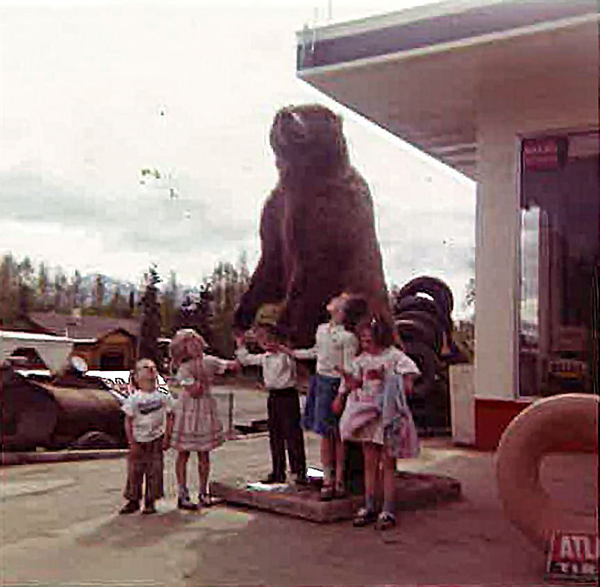
Young children pose with a stuffed standing brown bear outside Yeager’s Service in the late ‘50s. The log house on the other side of Stewart St. is still there. The bear is from the owners’ son in law who was a hunting guide. [Photo courtesy Randall Montbriand]

The station as it appears in November 2018, seen from the opposite side of the Glenn Highway. Before 1965 the roadbed was near the floor of the building and there was direct access by bouth outbound and inbound traffic on the two-lane highway. In the course of improvements the roadbed was lowered 25 feet, the roadway divided — and the station was now on a side road separated/disconnected from the highway by a weed-covered bank topped with a chain link fence. To the left of the station is a small hotel and to the right, a carport that’s part of an adjacent multiplex dwelling.
![1958 aerial photo of the vicinity, annotated by Randall Montbriand showing the conditions when the Wonder Park neighborhood and Yeager’s gas station were developed. [Photo courtesy Randall Montbriand]](https://images.squarespace-cdn.com/content/v1/5771e6b1f5e2314b4833ec6d/1542427519081-S5X57XVFYW3G45ASJXTD/annotated+1958+aerial.jpg)
1958 aerial photo of the vicinity, annotated by Randall Montbriand showing the conditions when the Wonder Park neighborhood and Yeager’s gas station were developed. [Photo courtesy Randall Montbriand]
![Another Montbriand-annotated historic aerial photo showing how the new Glenn Highway [dashed line] bypassed Mountain View in 1965. The subsequent decline of Mountain View can be partly attributed to the decision to bypass it. [Photo courtesy Randall…](https://images.squarespace-cdn.com/content/v1/5771e6b1f5e2314b4833ec6d/1542427718817-WCORSNNV3EQOR6N3Z83W/annotated+aerial+02.jpg)
Another Montbriand-annotated historic aerial photo showing how the new Glenn Highway [dashed line] bypassed Mountain View in 1965. The subsequent decline of Mountain View can be partly attributed to the decision to bypass it. [Photo courtesy Randall Montbriand]
![Anchorage Times article ca. 1965. [Scrapbook content courtesy Randall Montbriand]](https://images.squarespace-cdn.com/content/v1/5771e6b1f5e2314b4833ec6d/1542428240455-1KPVUYTE6HPA2BPA2VBT/news+item.jpg)
Anchorage Times article ca. 1965. [Scrapbook content courtesy Randall Montbriand]
![The Christmas miracle the Yeagers were nudging along failed to materialize. [Scrapbook content courtesy Randall Montbriand]](https://images.squarespace-cdn.com/content/v1/5771e6b1f5e2314b4833ec6d/1542428383332-O6Z0QYQXQ6JMB07W2CW8/christmas+miracle.jpg)
The Christmas miracle the Yeagers were nudging along failed to materialize. [Scrapbook content courtesy Randall Montbriand]

Canopy, pump island and entrance to office area in November 2018. Small hotel across Stewart St. in the background. Remnants of accent striping on the canopy fascia and the concrete block wall. The former retail area on the left side was converted to an additional repair bay during the repair garage era.

Pump island, office entrance, canopy and repair bays.

Under the canopy. Door to one of the restrooms and the office area windows and entrance; repair bays beyond.

The former retail area on the east end. There is a large window on this end wall in the old photos and today can observe an outline where it was filled in with concrete block.

The same end wall seen in a view looking north. Taku Drive beyond, with the metal guardrail and chain link fence at the top of the highway embankment.
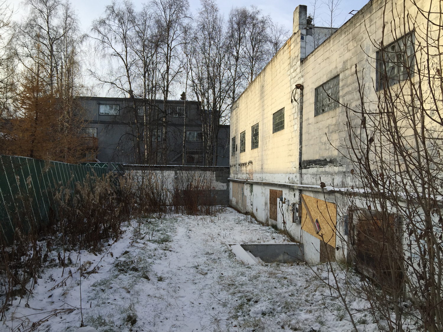
Grade at the back of the building is six feet lower than the front. There is a grassy yard here and entrance to an apartment on the lower level — a unique feature to the building not seen on most gas stations. I didn’t go inside so not sure of the exact configuration; the apartment appears to be under the east portion and not necessarily continuing below the repair bays, based on building area details in city tax records, and lack of windows on the west end. There were hydraulic car lifts in the repair bays so perhaps those needed to sit on a solid thickened slab on grade? The apartment entrance is in a well and the floor is three steps below the yard. The apartment height is 7’-8” from lower level floor to underside of concrete slab above and the slab protrudes slightly from the back exterior wall.

In my concept to turn this hulk into a high end custom house I started with the idea that the 14 foot height repair bays and office area would become an open Living/Dining/Kitchen, with a small Walk-In Pantry, Bar and access to the entry and the bedroom area. The garage doors are replaced with aluminum frame storefront windows [one of the more expensive and extravagant parts of the concept, but essential]. There is a 12x12, two-story addition at the back with a stairway that connects the lower level and accesses a new deck. Part of the back yard becomes a driveway off Stewart St. for the residents. The existing restrooms are demolished, retaining the restroom door locations for the entry and exterior access from the Guest Bedroom. There is a Guest Bath behind the ample Mud Room Entry. The rest of the existing [+/- 11 foot height] space including the former retail area become a Master Bedroom suite, with a Master Bath and closet area with built-in wardrobe cabinets. The existing exterior openings are mostly retained and the infilled east window at Master Bedroom is restored [this one will have a view of the mountains].

The south end of the building with the new driveway, deck and entry addition. A stepped timber planter smooths the grade transition and the former apartment entrance well is integrated into a greenhouse room underneath the new deck. New windows are installed in the existing openings in place of the broken glass block lites. The remodeled lower level could be a separate accessory dwelling unit [mother in law apartment], shop/storage space, additional bedrooms and bath, a home office — or some combination of any or all. On the upper site plane, grass and landscaping occupies most of the former paved area.
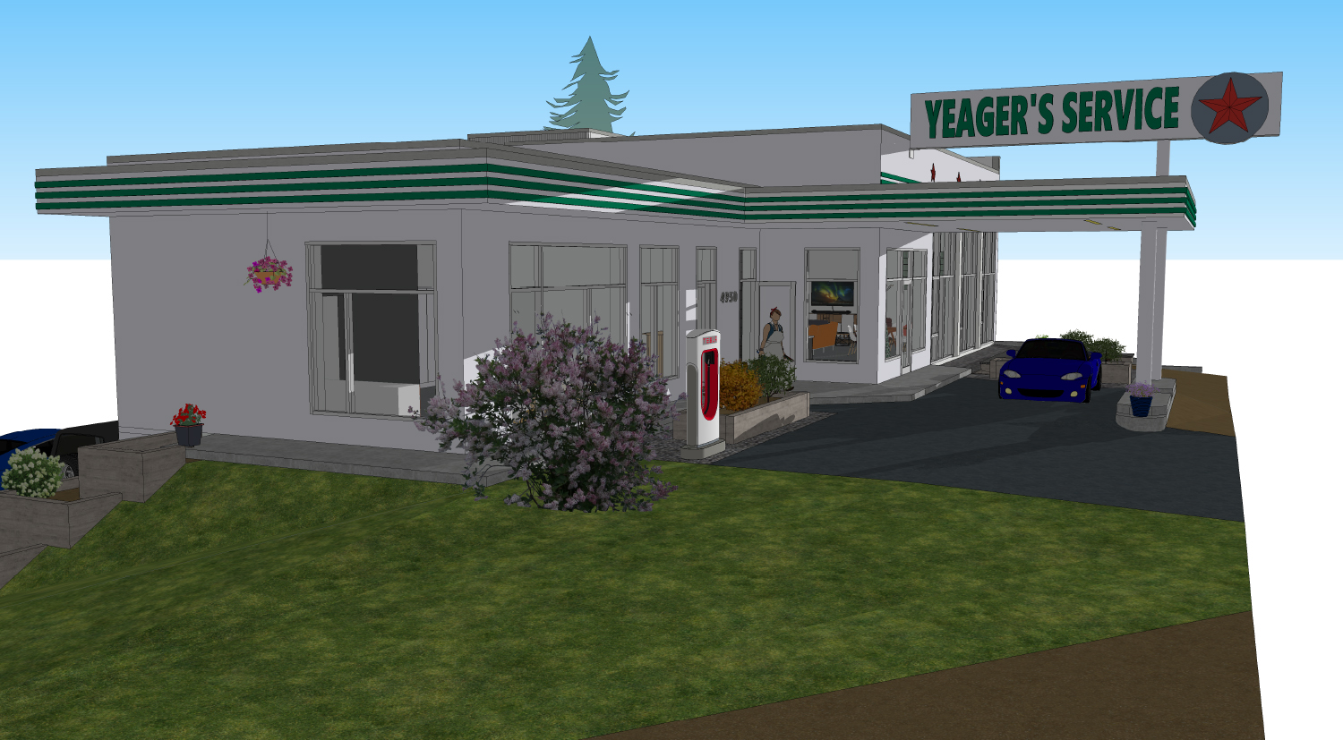
There’s a smaller driveway off Taku, including covered parking under the canopy. An electric vehicle charging station, shown here outside the Master Bedroom would be a way to continue the vehicle service legacy of the site in a limited way [perhaps relocated to the street corner?]. Original features including the accent stripes and signage are restored and the building is painted white the same as 1950s Texaco stations.

Under the canopy in the remodeled building. An oil can display in the window acknowledges the building’s past. On the right are the new aluminum framed storefronts in the old garage door openings. On the left is the new entry [one of the old restroom door locations].


Outside the former repair bays, a fire pit area with built-in bi-level deck/bench, timber planter, gravel surface and planting bed border. This will add to the privacy of the living area of the house, and it’s just far enough away and above the highway that it will still be a pleasant place to hang out in the evening, especially at the height of summer when the sun’s path at sunset will wash the north-facing front of the building.

South side, with photovoltaic and thermal solar panel array on the west and south sides of entry addition and south side of living area above the windows.

Open Living/Dining area in the old service bays. Replacement glass block is used on the window on the west end wall since that wall is on the property line and the glass block can meet the required fire rating.
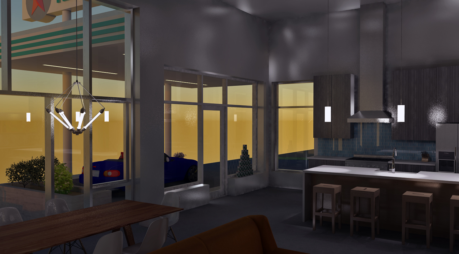
Wouldn’t it be incredible to sit in here on a winter evening and watch snow gently falling, or an aurora through the giant windows?

The main living space is large enough to be very versatile for large gatherings including performances and events.

Kitchen has a 36 inch range, custom hood, taller than normal upper cabinets, 14 foot long island with sink and dishwasher and pendant lighting, 9 foot long bar beyond and walk-in pantry inside the yellow walls. Between the refrigerator and the pantry is an opening to access the entry and bedroom wing.
FRamE Hall of Fame: Reyner Banham
British-born architectural critic/historian Reyner Banham [1922-88] is perhaps the greatest interpreter of the city of Los Angeles -- how it happened and what makes it tick. His writings about the place, and especially his short film Reyner Banham Loves Los Angeles [1972] deconstruct the city as no one else has done before or since.
I love L.A. almost as much as Banham, and find it an incredible garden of earthly delights with a rich, unexpected array of resources. It's also completely out of control and over the top. I visited in simpler times -- 1976, 1982 and 1985 and not since. It's not everybody's cup of tea. [Mike Davis's book, City of Quartz offers a useful perspective of modern-day L.A. as it has developed in the years after Banham's passing.]
In the early 1930s quite a few show business actors, producers, writers and crewpersons relocated to Los Angeles from New York, as Hollywood became the headquarters for motion picture production. In the book Grocuho, Chico, Harpo and Sometimes Zeppo, a Marx Brothers bio by Joe Adamson, the author recounts a cross-country trip by S.J. Perelman and Will Johnstone, comedy sketch writers for the Marxes:
"Now we cut back to Hollywood, where Perelman, thoroughly appalled all the way across the country by his prolific partner [Johnstone insisted on doing watercolors of every vista that came into view, besides getting three weeks of comic strips finished in three days, all with a hand shaken by a rocky roadbed and three crocks of illegal applejack], now stepped off the train to be appalled anew, by what he later described as a land of "Moorish confectionaries, viscid malted milks, avocado salads, frosted papayas, sneak previews... studio technicians, old ladies studying Bahaism, bit players, chippies, upraised voices extolling the virtues of various faith healers or laxatives... the city of dreadful day... Bridgeport with palms... a metropolis made up of innumerable Midwestern hamlets... an unalloyed horror... a hayseed's idea of the Big Apple... everything about that city's murders had the two-dimensional quality of American life... viewed in full sunlight, its tawdriness is unspeakable; in the torrential downpour of the rainy season, as we first saw it, it inspired anguish... After a few days I could have sworn that our faces began to take on the hue of Kodachromes, and even the dog, an animal used to bizarre surroundings, developed a strange, off-register look, as if he were badly printed in overlapping colors."
Perelman didn't get it. Banham did. In England and elsewhere Banham used to cut a sporting figure [tall man with a neat suit and bushy beard] riding a folding bicycle. He learned how to drive later in life when living in L.A. so he could understand the area better. In his 1971 book Los Angeles: the Architecture of Four Ecologies he breaks down the area's experience by geographical overlays, and in so doing deepens our understanding of its unique cross-cultural mashup and novel aspects.
Also really enjoyed his 1982 book Scenes in America Deserta. This one is out of print and hard to find, but worth it. Banham uses his investigative and analytical triangulation to cast a wider net over the wide open spaces of the American West.
There is also a 2003 biography of Banham called Reyner Banham: Historian of the Immediate Future, by Nigel Whiteley. It's a lengthy volume with lots of photos and graphics collected, and ultimately runs a little flat and isn't nearly as interesting as its subject.
Banham has the qualities I like the most in writers and documentary producers: an infectious enthusiasm and strong sense of humor and the absurd.
FRamE Hall of Fame: Eames Demetrios
Two nights ago at the Anchorage Museum I was privileged to listen to a presentation by Eames Demetrios, and then meet and talk with him briefly afterwards. As the grandson of groundbreaking designers Charles and Ray Eames, and current head of the Eames Office, Demetrios acts as caretaker/historian and archivist, providing continuity and keeping their work and influence at the forefront, while administering ongoing projects.
The presentation was bound to be fascinating, and he didn't disappoint. He said that at the core of Charles and Ray's design philosophy was a welcoming accommodation of guests; and this binds together the various design disciplines, in all cultures of the world. That was a revelation, and exciting to contemplate for a number of reasons. One gets multiple opportunities in life to host guests [and then later, to be a guest] and it is amazing that so many have no idea how to do it. As a guest, those times when the host is gracious and engaged are golden. Those are the memories that are treasured forever. As a Designer, this realization tends to put the work effort in focus and context.
Charles and Ray launched a dizzying array of pursuits, many of which didn't seem to go together or have a logical progression from one to the next. Others working in the 1940s and '50s had a similar bent, and I see it in a few people working that way today but it is less common.
The trait I most appreciated about them is perseverance, and the stories and anecdotal evidence Demetrios presented really reinforced it. There were many prototypes that absolutely didn't work, and projects that were abandoned because they were ill-suited for one reason or another. In some cases it took years of experimentation to lead to a desirable/useful result. Rather than consider any of these dead ends as failures, requiring redress and restructuring to prevent the similar failures in the future, they celebrated them. Such commitment is the major ingredient to their success and ability to innovate over and over.
Demetrios repeated some of Charles and Ray's quotes I'd heard before ["We take our pleasures seriously"] and filled in some gaps about certain struggles they experienced. Most of all, they brought joy and humor to most of what they did. The Do Nothing Machine was nothing short of pure genius.
In the beginning, I knew of Eames because of their fiberglass shell chair, a mid-century modern classic. The armchair version particularly is astonishingly comfortable, while not looking like it would be. It was a critical and financial success for them. It is only a small part of their body of work. I wondered what Charles, who died in 1978 and Ray, who left this world ten years later would do with an iPhone. [Nothing that most of the rest of us could possibly dream up, no doubt.]
FRamE Hall of Fame: Robert Liberty
What a joy it was to catch an hour long presentation by Robert Liberty today at Anchorage's City Hall. Anchorage Citizens Coalition brought him to town and titled his talk, Anchorage Can Get It Right. Indeed, Anchorage has been conflicted about growth and densification for awhile now. At this moment it's clear that the physical landscape has changed, and approaches to development and redevelopment practiced in the past are inadequate to enhance present and future quality of life.
While growth shock is a reality, opinions differ on the causes and best fixes. Just as when accomplished architects and artists visit Alaska on the Alaska Design Forum lecture circuit, or via another organization or venue, a Robert Liberty presentation is a chance to benefit from somebody else's experience [in this case, dealing with redevelopment strategies in a city that's now larger and denser but grew out of similar beginnings]. Portland is 60 years older than Anchorage, and about that many years ahead of us in their thinking and experimentation.
Of course, there's always an undercurrent [or sometimes, more prominent display] of skepticism that says, "This is Anchorage, not Portland; and it can't happen here". Liberty addressed that at the beginning, showing examples of infill redevelopment in cold climate, smaller cities. Yes, it seems that in many cities smaller than Anchorage there are more ambitious plans taking shape. He challenged the notion that we have nothing to learn by Outsiders. And then proceeded to show us some of what has been implemented in Portland without drawing any conclusions, or making any suggestions for Anchorage.
One important distinction he drew was in overall approach: fund outcomes, not projects. He used examples of two controversial projects there: proposed reconstruction of the I-5 bridge over the Columbia River connecting Portland with Vancouver, WA; and a proposal for a western freeway bypass. [Strikes one as so similar to large project proposals here: Knik Arm Crossing and Highway to Highway.] Why not, Liberty asked expand consideration of alternatives to include any that would achieve the same goals? [First, clearly establishing what the goals are.] This is almost opposite of what the typical process is in Southcentral Alaska -- specific projects are planned, and engineering firms and contractors are tasked with writing reports that justify the predetermined outcomes -- often with limited consideration of related consequences.
There's nothing like a couple of powerful aerial photos to help make your points. Liberty showed one of a typical US urban periphery, with a multi-lane freeway passing by marginally used industrial land, not well-connected between surface destinations and not hospitable or desirable. And next to it, about the same filled with a traditional city grid originating in the pre-automobile age. He noted that, in a compact connected grid, even with all the roadways only having two lanes there is a greater vehicle capacity compared with the pattern shown in the first aerial, because there are many alternate routes available.
Another fascinating example was from San Diego, where a road diet project converted a former five lane, two way arterial to two lanes with limited turning, and roundabouts instead of traffic lights at intersections. Where the old setup moved 20,000 vehicles per day, the new one still manages 18,000. With fewer lanes and fewer stops, the traffic moves slower but more continuously. Rather than turning left, one advances to the next roundabout and drives around it, making a 180 and then a right turn to destination. All that was an amazing achievement by itself -- the best part is that with the traffic calmed, the street has now become a desirable place to live and work -- and attracts residential development that never would have occurred along the former roadway.
Liberty wrapped up his talk with accessory dwelling units [a subject near and dear to us at FRamE]. ADUs, he said are an easy way to increase density that doesn't change the current appearance of neighborhoods very much. Anchorage has only had an ADU ordinance for a little over ten years, and they are still not allowed in R-1 zones [where they could possibly have the most positive potential impact]. They haven't really caught on yet, but there's so much potential as a way to leverage property value and diversify the experience of a neighborhood.
Anchorage talked a pretty good game in the late '90s when developing its Comprehensive City Plan, Anchorage 2020. The main focus was enhancing neighborhoods and developing Town Centers [i.e., dense neighborhood commercial centers with mixed use buildings]. In the years following, accomplishments have been disappointing and in many ways we are heading in the wrong direction. Liberty showed how a more honest accounting of goals and parameters would benefit us all, not only the few benefiting from continuation of present trends.
Residential stairs 101
Stairs can be a tough task for seasoned designers and are an aspect many homeowners have difficulty understanding. This post will attempt to establish some basic parameters and items to consider when planning a new house or an addition/remodel.
Stairs in commercial/public buildings have more rigorous rules than stairs in houses. In a house, the dimensional requirements for handrails, riser height and tread depth are relaxed somewhat to allow the stair to occupy less space while remaining safe to navigate and climb.
Architectural Record Magazine has for decades now selected its ten best houses on the planet in the annual Record Houses issue. Reading through these in the '80s and '90s, one was awestruck at how many of the winning designs featured stairs that appeared to not comply, for one, two or multiple noted reasons. In the most extreme example, a stair connecting a main and upper level consisted solely of 2" x 11" x 3 ft monolithic slab treads protruding from a side wall, without risers and with no railings of any sort. One wondered how on earth such stairs passed inspection and how their designers could sleep without picturing a two year old teetering at the upper landing area above a 10 or 12 foot drop-off. In recent years the trend has fallen off a bit, and the stairs in Record Houses generally appear safer.
Cultural differences might account for these stairs? One can notice, in photos of places outside the U.S. that it's pretty common that guardrails have much greater than 4" spaces, and they may be lower than we'd require them to be, or sometimes omitted altogether. One photo in an architectural magazine showed a group of people sitting on a rooftop deck in Amsterdam, 2-1/2 stories above the sidewalk. There was built-in seating, a fire pit and hot tub; and there were thin posts at about 6 ft spacing/about 2 ft inboard of the edge, but no guardrail or anything else to keep people from falling off. Part of growing up is learning to recognize and manage risk, and ideas differ on the best way to ingrain that in children. We might be too overprotective in some ways?
Protection for people of all ages can be enhanced by effective placement of stairs. Exterior stairs are magnificent in many locations. Outside of Los Angeles there are streets built in canyons where the houses are elevated well above the street but relatively close to it, and exterior stairs [tile on concrete steps with solid stucco guardrails, or something functionally similar] are a nice welcoming gesture and functional way to reach the front door from the street. In Southcentral Alaska, and anyplace else where there's winter weather for months at a time exterior stairs should be avoided wherever possible. The grandest exterior stair in Anchorage, at the Loussac Library was finally closed and demolished this year, after 30 years of struggling with its maintenance and safety issues.
In the neighborhood where FRamE is located there are four or five builder spec houses built in the early 2000s that are similar to 1970s split-levels, but instead of the lower floor being a half-down basement, these houses have two full stories above a crawl space. The front entrance is still spotted at a mid-level between floors -- so, even though doors could have been placed anywhere on the First Floor and would come out 18 inches above grade, there are none -- and to get into the First Floor, one has to first mount an exterior stair [with 9 or 10 steps, not covered by a roof] and then descend half a flight inside the house down into the lower level. Ridiculous, and never should have been built that way in the first place. These houses would be easy to remodel. In other cases it's much more challenging.
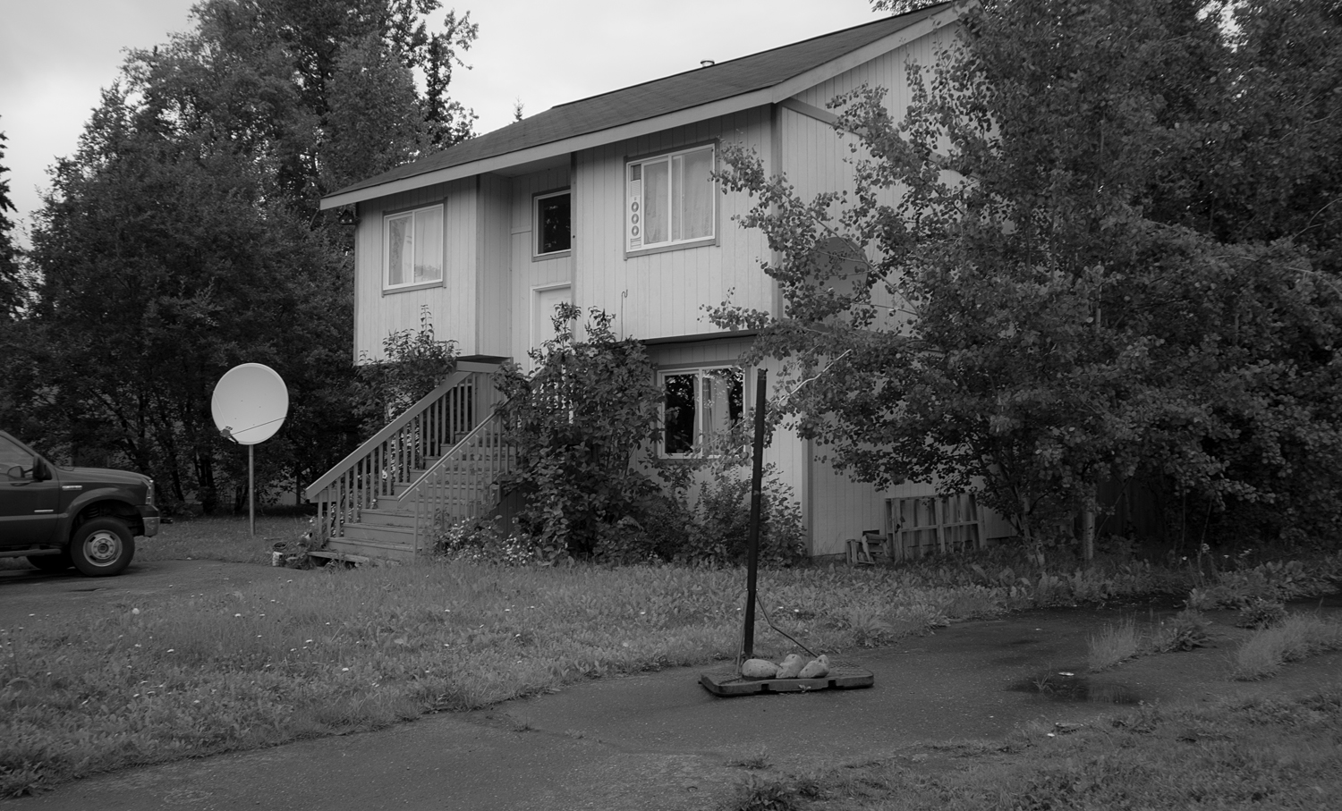
The house was built 15 years ago and the stairs have not aged well. There ought to be a way to enter the ground level directly.
Note that, even at ground level if there is a crawl space, and the floor framing is platformed on the top of the foundation walls there will still be 18 inches or so, minimum from the floor of the house down to grade. Plan to leave room for the porch and a couple of steps, and provide for a roof cover over them. In larger houses, or when conditions allow it can be effective for an area inside the front door to be a couple of steps lower than the surrounding floor area, and especially if the front door is oriented facing a prevailing wind direction. In the winter the depressed entry floor can function as a cold sink and the rest of the house will be less affected by cold air rushing in when people are coming and going. [It really works!]
Now that the entry placement is addressed and exterior stairs eliminated, let's consider how stairs fit inside the house. The common mistake of homeowners and novice designers is to not consider the stairs early in the thought process. Stairs connect to hallways and spill out into larger areas and are part of the circulation path through the house. The smaller the house, the more it benefits by a tight circulation pattern that minimizes the need to pass through intervening rooms on the way to others. Thus, it often makes sense that the stair is centrally located and not pushed to one end or the other. Whether or not the stair is right inside the entry is often an issue of preference. If you're entering at a floor level and not at a split entry, the stairs don't need to be in close proximity, and it might be better to tuck them in elsewhere.
In some circumstances a stair can be a feature, and include widened landings, lots of glass and other design features that take in territorial views or other special aspects of the site/setting. If the house is large enough, and depending on site characteristics two stairs can be placed instead of one. It's always nice to have options, and it can make the space feel more expansive and open than it would otherwise be, and even prepare for a future conversion such as adding a rental apartment within the house.
![Cross-section of Forever House [one of FRamE Featured Projects on this site]. Drawing shows stairs [dashed in, beyond] and their placement to connect the interlocking half levels of the house. A variation of switchback stair type.](https://images.squarespace-cdn.com/content/v1/5771e6b1f5e2314b4833ec6d/1471139169418-WZR6VSMCLM16D4PDO649/image-asset.jpeg)
Cross-section of Forever House [one of FRamE Featured Projects on this site]. Drawing shows stairs [dashed in, beyond] and their placement to connect the interlocking half levels of the house. A variation of switchback stair type.
The stair type that is used most of the time is a switchback stair. It is the least dangerous, and best reconciliation of utility and compactness. It is typically installed so its upper and lower landings are in a convening hallway, thus subtracting three feet or more of length. The mid-level [switchback] landing is usually the full width of both runs [including center wall, if used] combined, making it easy to move beds and large furniture items [compared to other stair types such as L-shaped, winding, spiral]. Since there's two runs it's not possible to fall down a full flight, as it would be on a straight single run. The switchback stair is usually placed between two rooms, with the mid-landing against an exterior wall. It can be placed in the corner [two sides on an exterior wall] -- if this is the case, better to have the upper run of stairs outboard, so the exterior wall height is lessened in case it is a structural issue [wind load resistance].
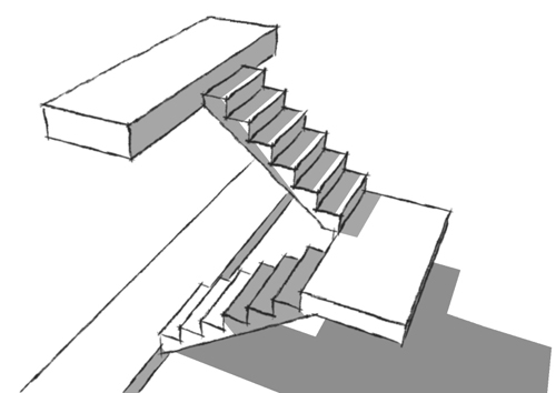
Typical switchback stair, with hallways doubling as landings at top and bottom.
If there's a drawback to a switchback stair, it is what to do with the leftover space underneath. Most often, it becomes a closet, and not a very useful one since the tallest part must be left unencumbered for access to the lower areas at the back. It might be possible for the upper run to protrude into adjacent room/space and not be enclosed?
The tri-level is a suburban tract house variation that was popular in the 1960s and not after that. The main criticism of it is that it divides the interior into three distinct areas that don't communicate with each other well. FRamE is looking for it to make a comeback, in this new era where people are looking for effective designs for short term rentals. It seems perfect for that -- Owner's suite above rental suites, with the mid-level [Entry, Living-Dining-Kitchen-yard connection] shared. [And both the upper and mid-levels can easily have high vaulted ceilings.] The stairs on a tri-level are similar to switchback stairs, and although in a tri-level the two runs don't need to be next to each other, they most often are for circulation efficiency.
![Stairs in a tri-level. Basement [about three feet below grade] on left, crawl space below mid-level on right. The area left over under the stairs isn't as much of an issue.](https://images.squarespace-cdn.com/content/v1/5771e6b1f5e2314b4833ec6d/1471134691805-5XUGE6YAQFCCOET9258L/image-asset.jpeg)
Stairs in a tri-level. Basement [about three feet below grade] on left, crawl space below mid-level on right. The area left over under the stairs isn't as much of an issue.
Another stair type frequently seen is the L-shape. Sometimes the mid-landing is at or near the halfway point; more often it is close to the bottom. This arrangement will feel better if there are at least two steps [two treads; three risers] on the lower run rather than just one. Will just need to make sure that required 6'-8" vertical clearance is met and coordinate floor opening/framing above, depending on floor to floor height. Another consideration is how the L-stair fits into the floor plan. As an example, if the stair run is 44-1/2" wide [clear; 45-1/2" framing dimension] the two 10" deep treads on the lower run will flush out with a hallway wall enclosing a 60" deep room [perfect size for bath, laundry, closets]. If you're tucking a bathroom under stairs, don't push it too far -- in at least one instance, a tub/shower under the stairs -- long part of tub parallel to stair run; shower valve and controls on the taller side -- worked out well in every detail except the shower rod and curtain were cut off by the angled ceiling under the descending stair.
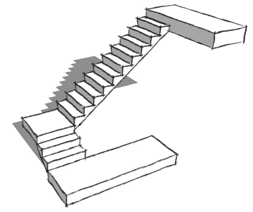
Preferred L-shape stair, with minimum three risers on lower run. Consideration should also be given to railing and side wall configuration in order to allow largest furniture, built-ins, appliances, etc. to be moved in and out of the upper level.
There's a lot of demand these days for spaces in houses to be multi-functional. And there are a lot of ideas out there for stairs in this regard. Some of them are good ideas. A switchback stair with a widened landing, a bench and a large window [particularly one that frames an interesting view] can provide a great little away space while spilling daylight into the stair and adjacent interior. It does this without any compromise to safety and utility. Other ideas are more questionable. It doesn't seem like a good idea for a step to double as a drawer. Maybe on a sailboat? But in a house, sooner or later the drawer will be open when coming down the stairs in the middle of the night -- and stepping into the drawer rather than the next stair will cause an injury. It's not worth it. Let the stairs be stairs, and find some other way to provide extra storage.
Oooh, that smell!
The office stinks! I can't be the only one that's noticed the distinct smell of an architect's office. Can I describe it? There's definitely graphite in the mix. And paper. And maybe ink? Stain and paint. Toxic off-gassing from material samples? Wood and concrete? Strong coffee, certainly.
Perhaps it is an airborne combustion of all of the above mixed with tears of desperation? [That wouldn't be far-fetched.] However it is generated in the first place, it is remarkably persistent and transferable. It must move from the old office to the new one in the horsehair dust brushes and rolls of old plans, and fans out upon arrival.
I was probably a month or two old when I made my first visit to my dad's office, and by the time I could walk and talk the scent was familiar to me. In those days, there was also ammonia and cigarette smoke in the mix.
There's a lot less of the smell in modern offices. At Bezek Durst Seiser's office, the smell was 90 percent gone from the main studio, but it was strong in the bathrooms when I first started working there in 2005 [until the rooms were remodeled]. At a building downtown near the Federal Building, I noticed the smell is still there [strong in the shared corridor and elevator] even though the architect's office has moved out.
I was kind of tickled the other day when I opened the front door of my house and the architect's office smell was spilling out into the living area from the offices of FRamE! Whoa!
A while back I noticed a news item that somebody was developing a GMO garlic that was scentless. Heresy! Why would you deprive yourself of that aroma [even if it isn't your favorite?]. What I didn't realize until recently [another case of, you don't know what you have 'til it's gone] is the garlic experiments were a symptom of a larger conspiracy to eliminate a major part of experience of an interior environment -- one that architects used to control.
FRamE Hall of Fame: Ralph Alley
Ralph M. Alley was an architect in Anchorage from the 1960s until 1986, when he relocated to California. He worked for larger firms at first, then in his own practice and later with business partners. In 1968 when he launched his own firm, Big Oil was ramping up its Alaska investment and a wild time ensued for four decades until the current hangover phase.
My dad had mentioned Alley before, and they were about the same age and were in Architecture school together at the University of Idaho. Ralph was gifted and stood out amongst his contemporaries, but with a good temperament and enough business sense to be able to succeed. Somebody who worked for him once told me, "He was a good architect. Some of his designs were a little weird" -- going on to imply that he was a decent role model and with a great grasp of the essentials [how to wrangle a contractor; how to get projects built the way they were envisioned and so forth].
Ralph was a design guru of Anchorage, in the way that Mark Ivy has been -- and Mike Mense, Catherine Call, Bruce Williams and many others, each in their own fashion. The clients who were tuned into what Ralph was doing were drawn to him implicitly, and he commanded respect by being thorough and attentive. I imagine when he told them he was planning a tapered, oval 14 foot high, skylight-topped light well at the peak of the living room ceiling, his judgment was not questioned.
Any great artist notices details at a level far beyond what ordinary humans take in. In Alley's case that translated to an intricate knowledge and understanding of quality of daylight on a daily, seasonal and annual basis; so unique to polar regions. A light quality that is stunning and fleeting. And this study became foundational to his design response to a site.
What I really appreciate about his work is its variety. He didn't have a "firm signature" or a certain approach that he mined. Like the musicians I most admire, he didn't stay put; rather, pursued many styles and conceptual frameworks and a truly individual approach to each project.
Some of the larger projects he completed survive relatively intact -- the Captain Cook Hotel, Evergreen Memorial Chapel downtown, and Fairview Recreation Center among them.
In 1999, Alley returned to Anchorage and conducted a tour of some of his projects. The tour concentrated on residential work. In some cases we got to look at the inside and outside of the house.
I was on the tour in 1999 and took a few photos.
A house on Mallard Lane. There are two houses on this street and Alley designed them both. The street is at the north edge of the main campus of the University of Alaska Anchorage. Both houses are still there but feels like they are threatened by UAA's building boom. The concrete walls on the lower level have embedded stones like the walls at Taliesin West. I liked that the house is still a rich dark brown as it was originally.

Another side of the same house. Notice here that the canopy roof at the beltline is roofed with lapped cedar planks. Ralph may not have invented this detail, but I hadn't seen it before.
![Back yard [south] side of the other house on Mallard. Can't recall for sure but it may be that the lower portion on the left was an existing house. Alley's remodels typically involved a thorough reworking of any existing re-used spaces.](https://images.squarespace-cdn.com/content/v1/5771e6b1f5e2314b4833ec6d/1468309411968-Q6YGTZCJZ25DG5AA85YZ/image-asset.jpeg)
Back yard [south] side of the other house on Mallard. Can't recall for sure but it may be that the lower portion on the left was an existing house. Alley's remodels typically involved a thorough reworking of any existing re-used spaces.
And here is the man himself, pointing out some of the details of the roof shape and drainage, and fenestration of a house on Arlington Dr. in Spenard-Turnagain. Elements are shifted compared with expectations and ostensible placement -- for example, the first floor windows all appear to be typical height and head height, yet the large portion of the first floor is a high ceiling space, the floor of which is below grade and the window sill height is 4 feet. Alley related a tale of how this house got called the ugliest house in Anchorage. [It is far from that!]
![The roof is an inverted pitch [as can be noticed in the upper right], with drainage through spillways slotted through. We didn't get to go inside this one -- would have loved to see how the second floor spaces were used. The balance of t…](https://images.squarespace-cdn.com/content/v1/5771e6b1f5e2314b4833ec6d/1468309887474-6IZI5GI6NOV8BY2SWH9Y/image-asset.jpeg)
The roof is an inverted pitch [as can be noticed in the upper right], with drainage through spillways slotted through. We didn't get to go inside this one -- would have loved to see how the second floor spaces were used. The balance of the house rambles a bit, taking advantage of its site with its south exposure on the long side of a corner lot.
![Street side of house on Hillcrest Dr. This photo from 2016, since I didn't have one from this side in 1999. The main entry door [not the original door] in the center between two stealth garage bays. Inside the door are slatted wall…](https://images.squarespace-cdn.com/content/v1/5771e6b1f5e2314b4833ec6d/1468310163745-GBLQ81KI07P0QVGH91E7/image-asset.jpeg)
Street side of house on Hillcrest Dr. This photo from 2016, since I didn't have one from this side in 1999. The main entry door [not the original door] in the center between two stealth garage bays. Inside the door are slatted walls dividing off the garage bays and making a fairly wide passage to the main space of the upper level.
Back to 1999 and the other side of the same house. This side faces east. The partially covered decks on two levels are positioned to get good afternoon sun. In the foreground is Tony Zedda of Kobiyashi Zedda Architects, who was visiting Anchorage at the time and went on the tour. He was the only one of the group who walked all around each house and observed it from all angles. I noticed him at each stop when scouting photo locations.

Upper level interior at Hillcrest. The woman at center frame with red jacket was along with the tour and this house was her childhood home in the '70s. Her father must have hired Alley to design it. She hadn't been inside for awhile and seems strangely fascinated. To her left in the photo, Alley speaks to another tour participant. On the right of the frame [white hair, glasses and green shirt] is Ed Crittenden [1916-2015], Anchorage architect of major stature. Ed and Ralph carried on an amusing banter in the van, driving between projects. It must have been much the same as their '60s and '70s interactions. Ed's projects were much larger but everybody wanted to hear Ralph talk. Sort of, the difference between immense respect and true love.

Another 2016 photo, this one of an Alley house on Stanford Dr. Almost all its original features and color scheme remain. Love the thin lines projecting down from the gable on the white panels, adding a graceful touch to an assemblage that's otherwise a bit heavy-handed. This man really knew what to do with a few good diagonal walls, and how to articulate a façade. The entry area is a recent remodel, but a sensitive one.

Further to the right on the same street side of the house, 17 years ago with the tour group. This roof projection begins at the cantilevered beam as a soffit, and somewhere between there and the corner of the house becomes a fascia. And more of the thin line accents on a white field.

This house, more than any of the others we saw that day was where Alley's full range of creativity and novel concepts were unleashed. Someplace in the middle is a standard Turnagain tract house that left its foundation and slid down the street during the 1964 earthquake. The house was moved to this lot [off Raspberry Rd., west of Sand Lake Rd.] the following year, and surrounded by multi-level additions. This house was designed for Lowell Thomas Jr., an adventurer/entertainment producer and former Lt. Governor of Alaska. Thomas and his wife sold the house and moved to Hillside after the construction of a perpendicular runway at the airport made the neighborhood a lot less peaceful than previous, but the house survives fairy intact. There is a large living room with dark stained shelving that used to house Thomas's fabulous book and artwork collection.

FRamE Hall of Fame: SITE/James Wines

SITE's Parking Lot Building concept for Best Products.
In 1988 or '89 when James Wines was on the lecture circuit he made a stop in Anchorage and spoke at an AIA Alaska Chapter event that was part of a series on collaboration between artists and architects. After his talk, where the audience gathered in the Museum theater lobby, I went up to Wines, told him my name and said something like, you guys and your work are SO GREAT! [Or something else equally dorky -- I forget exactly what it was.]
"Well, thank you! Are you an artist or an architect?"
"Kind of, both but yet neither."
"Hmmm -- sounds as if you are on the right track!"
This was like meeting a childhood idol! I was totally enthralled.
In the Summer of 1984 I started working for Livingston Slone. On the table in the library was a recent issue of Architectural Record, with a feature story on SITE and focusing on the Best Products stores. Immersing myself in the words, philosophy and visual imagery, I was transformed, personally and professionally forever. This is what kept me in the game mentally at architectural firms [up until then, I wasn't too sure about it] and informed and influenced everything I would do in the ensuing years.
Beginning in the '80s and continuing unabated today, the retail and commercial design world has lived under a push for standardization. Every store, everyplace in the country [or U.S.-controlled base in another country] should offer a matching experience. Familiarity as currency. Any building type or larger development [apartment block; corporate office campus; shopping mall; neighborhood mixed use commercial center] was subject to a similar dictum -- novelty and individuality were discouraged, blunted or prohibited outright. In retail, the prevailing style gravitated toward a clunky, utilitarian layout festooned with a grab bag of historical elements, often comically over-scaled [25 foot high letters hovering over a colonnade of 10 foot square stone covered porch columns] and deployed with varying degrees of success depending on context.
The Best projects represent the last gasp of Architectural creativity allowed to flower in a garden variety commercial retail realm. The projects had all of the ingredients somebody like me, a child of the 1960s raised in an era of change would be attracted to: a mocking derision of mainstream dogma; a healthy skepticism of guiding principles of big business; an "in your face", ribald, stripped-down aesthetic that on one hand seemed like a cheap gimmick after a jaw-dropping, dumbfounded reaction [WTF am I looking at?] and on the other got deep into our collective psyche and notions of order and chaos.
In the late 1980s Anchorage lecture, Wines did not disappoint, showing a college project by an anonymous Architecture Dept. student that, in one building study model showed almost every known modern and post-modern design cliche. Talking about the designs and ideas for Best, Wines' pithy quote was something like, we take the fact that the client is a cheapskate and doesn't want to spend much more than the bare minimum on the project, and try incorporate that into the aesthetic of the building. The result is the Houston area Best store, with crumbling brick facade; the one with the front facade detached and moved forward, with what looks like a dense native boreal forest between; and the Tilt version in MD, with the front brick facade partially disengaged/elevated and leaning against the rest of the building mass.
The greatest by far Best design for me was the Parking Lot Building, an unbuilt design wherein the asphalt pavement, complete with striping, traffic aisles and light poles, rumples [in a way that reminds me of a living room rug that needs to be flattened out and straightened] up over the building volume, the front and back facades peeking out from underneath. Nothing I've seen says more about the dystopia we have created by mandating unbridled sprawl development in all but a few places -- and the bland uniformity that approach entails.
SITE has been an early adopter of green buildings, and ahead of other trends [re-embrace of Deconstructivism as an acceptable approach, for example]. At their most influential times they've been an important voice of dissent, that should come from establishment channels that have been strangely silent on these matters for years.
One can see evidence of SITE's influence all over. In Seattle, the downtown REI building [the entry to which is through a forested glen that also is located in the urban core and shadow of a freeway] seems like a logical extension of the Best Forest Building. And Steve Badanes and his collaborators who incubated the Fremont Troll concept must have been paying attention when SITE covered cars with asphalt a few years earlier.
The time is ripe for a big retailer to buck the trend of boring sameness and reinvigorate their brand by going a different way. Starbucks and a few others show an occasional flash of brilliance when they conduct adaptive restorations on older buildings or otherwise display a willingness to break away in some small gesture. Wouldn't it be great if Ikea, or Target or Costco took a flying design leap and took it upon themselves to foster a whole new design approach that brought back joyful, unexpected and even unsettling aspects?
Which rooms need the most work?
If a homeowner hires a Designer to plan a renovation, which rooms do they focus on first? Which ones are most in need of an intervention?
One can find volumes of advice on this matter. A qualified designer [whether FRamE, or another] will assist the Owner with these deliberations and the narrowing-down of choices.
The first task should always be an observation and consideration of the existing conditions. In Anchorage -- as in most places in the United States to a greater or lesser degree -- much of the housing stock is not in great condition. Deficiencies generally fall into these categories, listed in greater to lesser severity:
- Conditions which constitute an immediate danger and must be corrected before work can begin
- Conditions which, if left uncorrected could become a danger to life safety
- Conditions which are not necessarily dangerous but could prevent certain upgrades [for example, a floor that is not strong enough to support addition of lightweight concrete topping and radiant heat piping]
- Conditions which are non-compliant to current codes and regulations but are allowed to not be corrected [specifically as noted under provisions of governing codes and as administered by authority having jurisdiction]
It's always a hard sell to an Owner when they are told they must spend substantial sums on concealed work that they hadn't previously identified. Legal aspects aside, it isn't worth it to try to shortcut the basics.
The observation typically begins with the foundation and roof, moving on to the structure of the floor/s, roof and walls after that. Other aspects to consider include mechanical and electrical systems; insulation and envelope related to overall performance and energy use; hazardous building materials; condition of exterior siding and trim; condition of existing interior finishes.
A great strategy for homeowner and designer alike is to have a contingency fund available to cover unexpected problems that come up as demolition and construction proceed. Basically, this entails not getting "maxed out"; i.e., planning a project that will cost, say 80% of the budget and not 100% of it. The percent amount of contingency may be less for a new house, or a remodel of a newer house; or more if the house is seriously deteriorated.
Codes and regulations, materials and prevailing best practices have gradually improved over decades. A house from any era may be well-built and feel reassuringly solid ["good bones"] -- in general, though the newer the better and the less corrective measures that will be needed.
With all that out of the way, and plans in place to deal with the deficiencies found, let's reconsider the original question.
The kitchen is the most remodeled room in the house, followed by bathrooms. This is true pretty much everyplace. These are the most equipped, most used rooms in the house and most affected by changing tastes and desires for reconfiguration [for example, converting a closed-in kitchen to one open to adjacent rooms].
In Alaska, two important features typically lacking in most smaller or middle-size houses are adequate storage [especially for outdoor recreational gear] and a Mud Room Entry. Often part of the garage is used for this purpose, and usually it is not suited to the task. In some cases there is only one entry to the dwelling unit; often there are two or more entry points and the one the people who live there use the most [typically located off the garage, carport or parking, and accessible without first passing through a garage] is fitted with a Mud Room Entry, features of which may include:
- A bench, either built-in or furniture, used to sit and remove shoes and outerwear
- Coat hooks, coat closet and other built-ins that accommodate boots, shoes and outerwear and places for these items to air out and dry off
- Located conveniently to 1/2 Bath and Laundry, and Gear Storage if provided
- Robust finishes to accommodate heavy abuse
In a house for a specialized purpose [for example, a ski chalet] there will of course be additional accommodations in the Mud Room Entry.
Expanded garages and workshops are also popular additions in Alaska.
In most places, experts can be found within the local design and real estate community who will offer researched opinions and/or data about which renovations have the most payback potential. This is just one part of a complex equation. It really gets back to the homeowner's preference. If the plan is to stay in the house for a long time, it might not matter that less than 100% of the new work is done with resale value in mind. Are you building for yourself and your family/friends, or a future buyer? Most of the time it makes sense to do what you want, while being careful that none of it is so unusual or weird that it would have very limited appeal. Adding bedrooms and bathrooms is usually a sure bet, especially if it might put the house in a more exclusive category -- such as, a house with three or four bedrooms, one of which is a master bedroom suite, vs. a 3-BR, 1 or 1.5 BA house. This is where identification of existing local inventory and demand can influence remodel choices.
The mushrooming popularity of short term room rentals suggests that plan configurations supporting greater privacy and separation [perhaps bedrooms interspersed throughout the house rather than grouped together? or suites that can be closed off from the rest of the house] will become more common.
Another way in which a design intervention can have a big impact is when the existing house, for one reason or another has failed to take advantage of its setting -- and there is potential to correct that to some extent. In Houston or Phoenix or someplace else that gets nightmarishly hot in summer the house and landscape design should provide shade and cooling. In Anchorage or Fairbanks, full-on sunlit indoor and outdoor space is usually highly desirable, particularly in the winter when daylight is precious and fleeting. If a standard 3-BR ranch house is plunked down on a 6,000 square foot city lot, often the orientation of the house and rooms is far less than ideal, whether you are trying to bathe in the sun or escape from it. Even in a place like Homer, Alaska where a majority of home sites have great southern and western exposure, a view of the bay and frequently both there are a lot of examples where there are not windows looking at the view, not yard spaces oriented to afternoon/evening sunlight; and various other ways the approach could have been improved/enhanced. Most have experienced walking into a room where the overall impression is very pleasing and one feels secure, relaxed and upbeat. It's because a designer understood the aspects of the site -- the sunlight path over the course of a day, a season and a year; the prevailing wind direction; ground exposure; elevation and characteristics of adjacent properties.